Manuel's
Restaurant & hospitalityAn Austin dining institution, organized for the way people actually use a restaurant website.
- Industry
- Restaurant & hospitality
- Location
- Austin, TX
- Scope
- 6 services delivered
- Live site
- manuels.com (opens in a new tab)
Overview
Manuel's has served interior Mexican cuisine in Austin since 1984: scratch-made tortillas, regional recipes, and a dining room people book for birthdays and business dinners alike. The website is the restaurant's digital front door, and it has to do a lot: present multiple menus, take reservations, route online orders, book private events, and hold up to the standard the kitchen sets every night.
The challenge
Restaurant websites fail in a predictable way: too much content, no hierarchy. Manuel's had every kind of content a restaurant can have: dinner, brunch, and happy hour menus with dietary options, a private dining program, gift cards, and a rewards club. All of it mattered to someone. The risk was a site where everything shouts and nothing gets found, especially on a phone, where most diners arrive minutes before deciding where to eat.
The approach
The build started with an inventory of the jobs visitors show up with: see the menu, book a table, order to-go, plan an event, find hours and directions. Every page and navigation decision was made against that list. High-intent actions like reserve, order, and menus stay one tap away from anywhere on the site, while deeper content like private dining and the rewards program gets its own well-marked home instead of crowding the main path.
Design direction
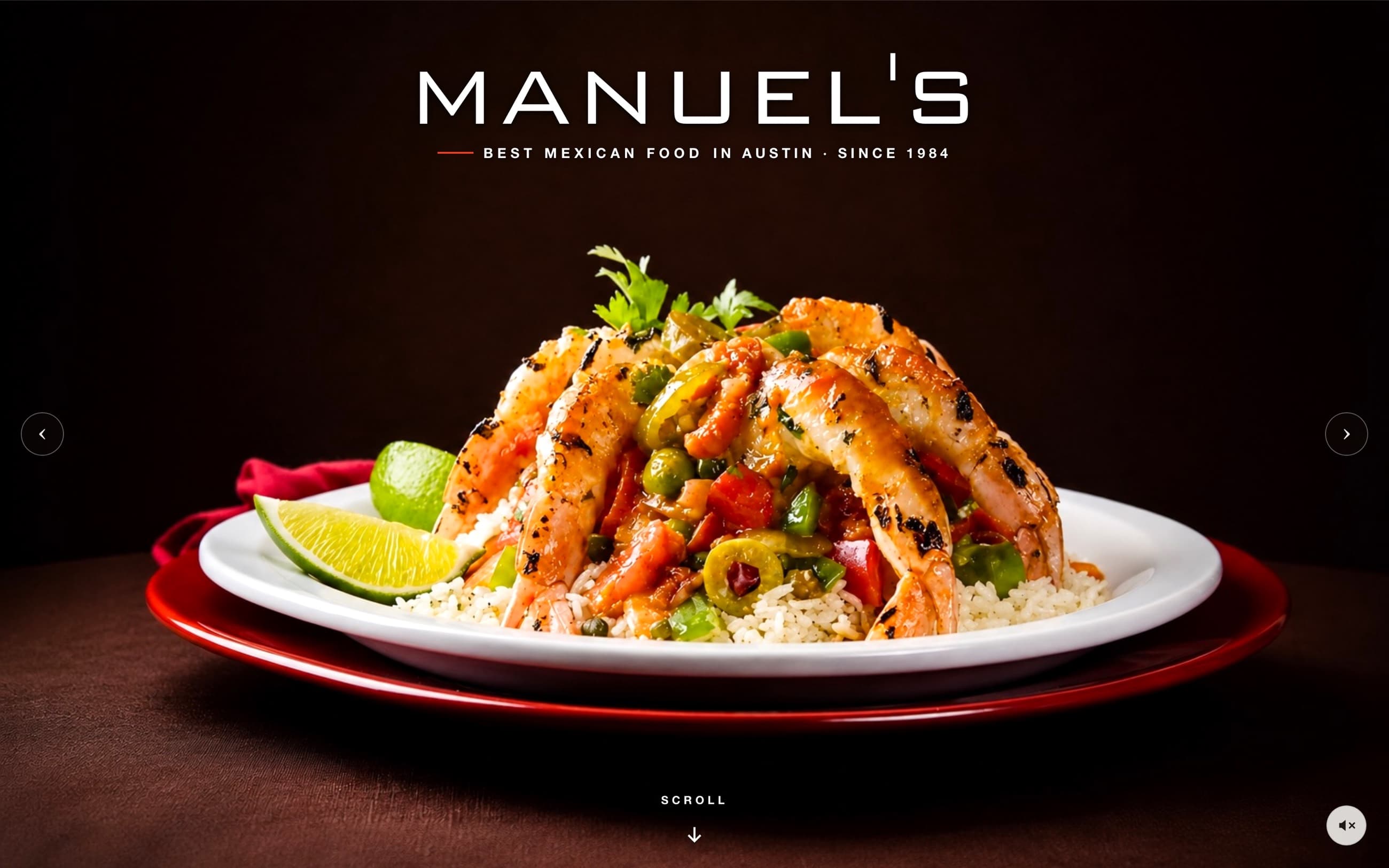
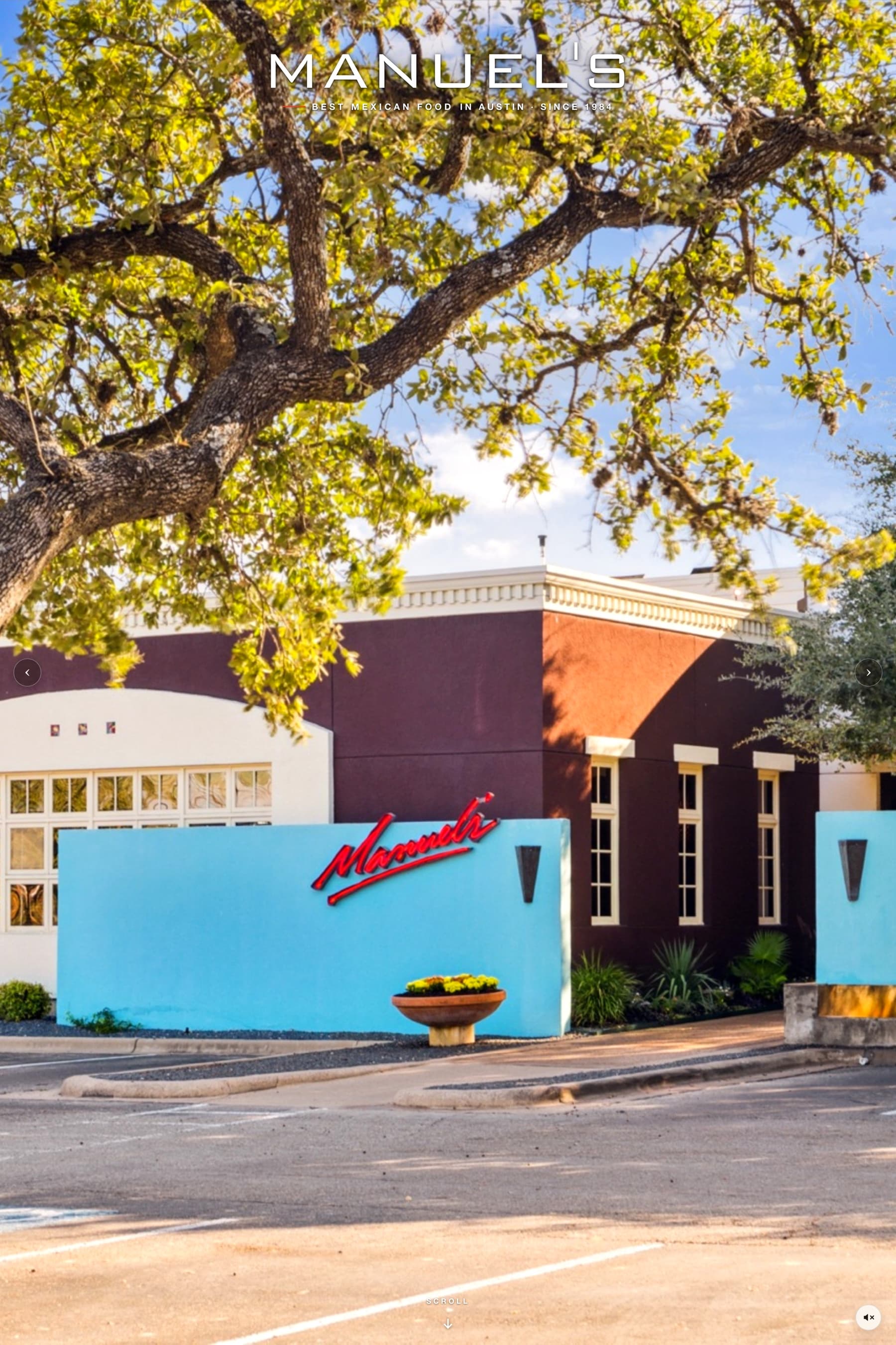
The design borrows its palette from the room itself: deep espresso tones, warm neutrals, and the red of the Manuel's neon sign. Typography stays quiet and confident so the photography of plated dishes, the patio under the oaks, and cocktails at the bar does the persuading. It reads as the restaurant, not as a template with the restaurant's logo on it.
Core functionality
Menu system with dietary filtering
Dinner, brunch, and happy hour menus that are readable on a phone, with gluten-free and vegetarian options easy to isolate.
Reservations via Resy
Table booking hands off cleanly to Resy, so guests finish in a flow they already trust.
Online ordering
Direct to-go ordering, kept one tap from the homepage.
Private dining & events
A dedicated section for party planning and private dining inquiries, with the details event planners actually need.
Gift cards & rewards
Supporting programs like gift cards, the frequent-diner club, and catering partners, organized without cluttering the main navigation.
Mobile experience
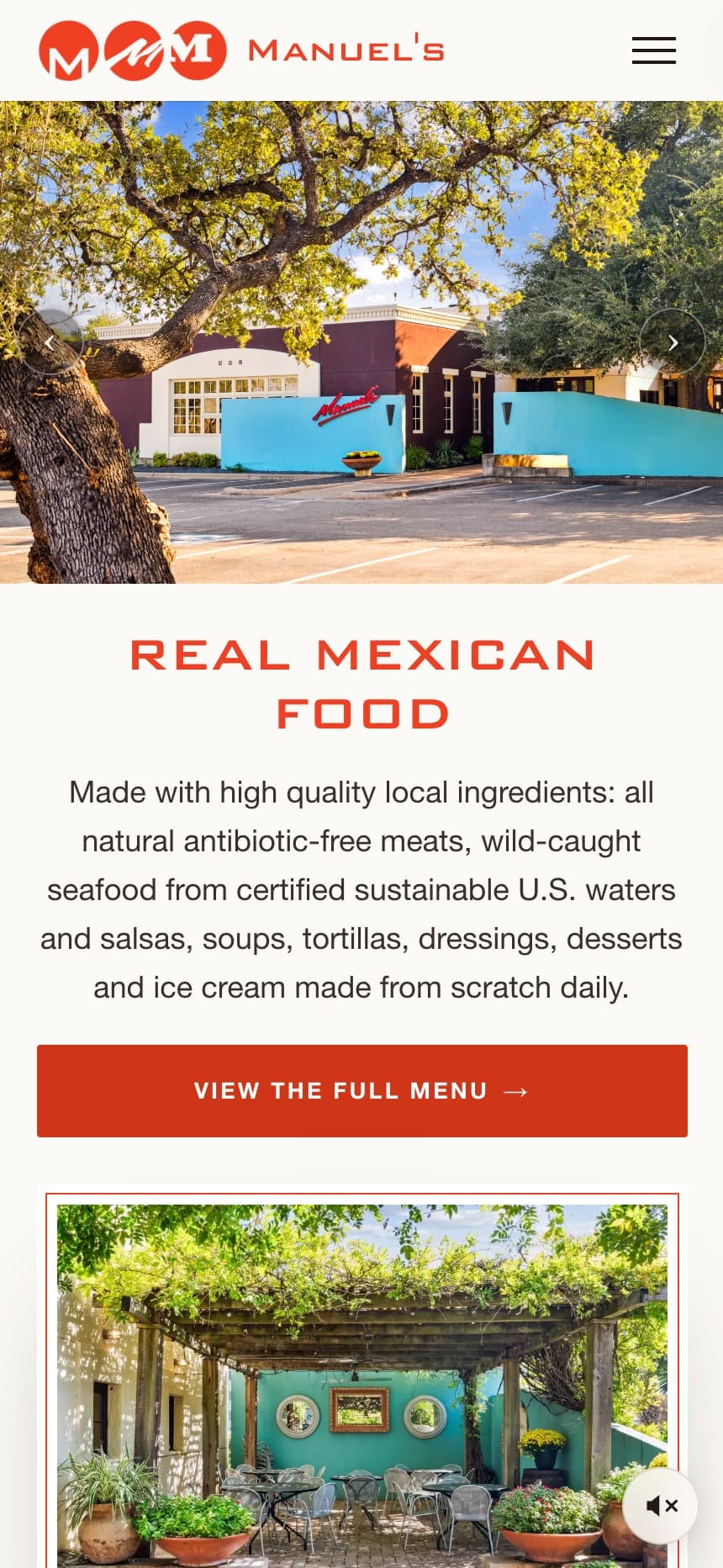
Most visitors are standing somewhere deciding where to eat. On mobile, the site leads with the essentials: menus, reservations, hours, and directions, each reachable in one tap, with menus set at a size you can read without pinching.
Development approach
The build separates menus, reservations, ordering, and private dining into their own paths. The menu system supports dietary filtering, while table booking hands off to Resy. Responsive layouts carry those same tasks from desktop to a phone without treating the smaller screen as an afterthought.
Search considerations
Menus, dining occasions, and visit information need a clear content hierarchy. The project’s local SEO scope centers on making the restaurant’s actual offerings understandable and easy to navigate. The case study documents that structure; it does not claim a ranking improvement or contain a measured before-and-after search comparison.
Conversion decisions
A table reservation, a to-go order, and a private event inquiry are different decisions. Each has its own route so a guest can move from the relevant information to the appropriate action. Booking-provider clicks should be distinguished from confirmed reservations when evaluating the site.
The outcome
Manuel's now has an online presence that matches the standard of the dining room: a clear structure search engines can read, menus and reservations that work as well on a phone as on a laptop, and a design that lets forty years of cooking speak for itself.
Services delivered
- Site architecture
- UX & content structure
- Custom design
- Responsive development
- Local SEO foundations
- Performance optimization